Visual power does not always rely on illustrations or striking images. In the graphic design realm, simple elements like typography are often the most effective attention-grabbing tools. In the context of modern design, typography can stand alone without needing images, provided it features a smart and expressive composition. So, you can say, it is the bridge between a visual’s aesthetics and communication.
One of the most important aspects of typography is the ability to use different font types in a design. Font combination is the process of combining two types of fonts in a design that are complementary, harmonious, and communicative with one another. This approach requires attention to contrast, style harmony, and proportions.
One way to apply font combinations is through Canva, a popular and readily accessible platform favored by many people. This article will specifically explore Canva font combinations, especially those combined with Din Studio’s fonts. Thus, you can generate a consistent, aesthetic, and effective visual appearance. Let’s get into it!
Table of Contents
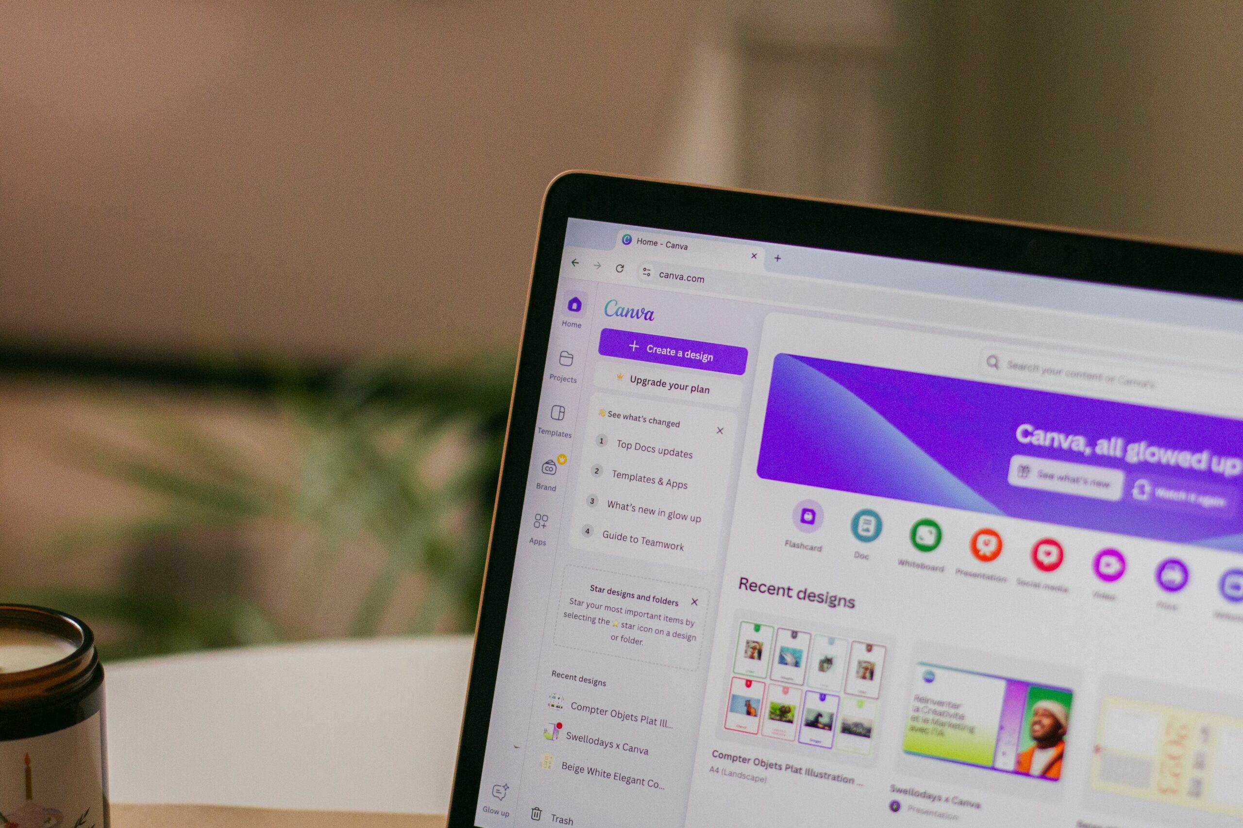
Canva is the best platform for creating a font combination due to its ease of use, comprehensive features, and remarkable adaptability. Aside from that, users are not required to obtain fonts from third-party platforms or consider their legality. As a result, designers, particularly beginners, can create appealing images without worrying about the licensing process. Also, you can access all these benefits anytime and anywhere via browsers or apps.
Canva provides thousands of carefully curated, commercially compatible templates in both free and premium editions. As a result, Canva has become one of the most user-friendly design tools for exploring typography and creating beautiful Canva font combinations.
Combining fonts can be quite a challenge, especially if you want to deliver a certain atmosphere or character in a design. To ease the process, Canva provides a wide range of font collections, ranging from the free versions to the readily available premium ones. Listed below are some Din Studio and Canva font combinations that we recommend you try to elevate your design to the next level:
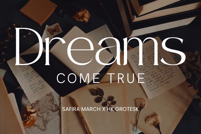
Safira March x HK Grotesk is one of the most outstanding Din Studio and Canva font combinations. This combination creates an elegant and sophisticated vibe. As shown in the image, the Safira March serif font with its sleek and graceful curves in the word “Dreams” emphasizes the refined style. It is one of Din Studio’s greatest fonts, accessible on both the Canva platform and our website, and it is ideal for a variety of elegant and professional designs.
Meanwhile, the HK Grotesk font is a clean and neutral geometrical sans-serif influenced by the Helvetica font but lighter. This font provides visual balance and improves readability in both large- and small-sized media. HK Grotesk is appropriate for subheadings, body texts, and additional details. Safira March and HK Grotesk are an excellent combination for various design applications, including wedding invitations, product packaging, and visual marketing materials for fashion and lifestyle.
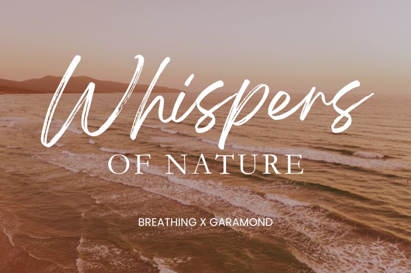
To create designs that embody expressive smoothness and a beautiful classic atmosphere, we need to understand the Canva font combinations of Breathing and Garamond. These two fonts appear harmonious because they complement one another so nicely. The Breathing font features a flowing brush script design that resembles handwriting created with brushstrokes. As a result, the font can convey an organic sense that complements natural or relaxing themes.
Garamond, on the other hand, uses serifs to give your design a robust, stable, and intellectual appearance. The character’s design is thin, making it excellent for supporting text or taglines to add professionalism. The high contrast between the two fonts stands out visually, ensuring that your designs appear more structured while remaining graceful.
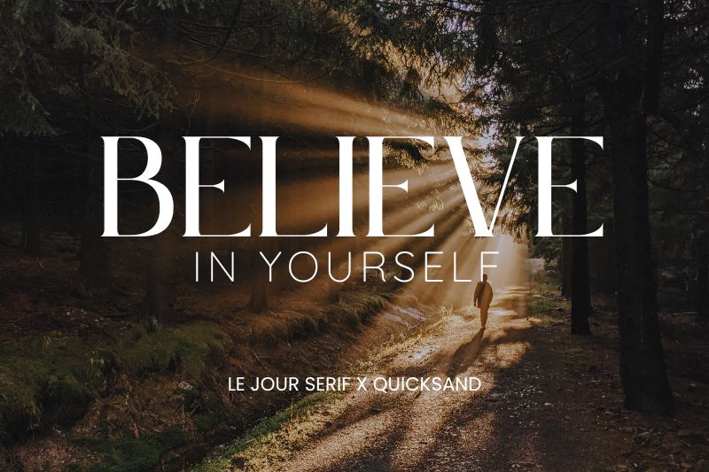
The image above showcases a combination of two font types available in Canva: Le Jour Serif and Quicksand, used to form the motivational phrase “Believe in Yourself.” The use of Le Jour Serif for the word “Believe” draws attention due to its bold and elegant appearance. This font has classic serif characters with a tall and slender shape, as well as sharp letter-end details, making it suitable for various design needs that prioritize a luxurious and feminine impression.
Meanwhile, Quicksand is a modern sans-serif font characterized by its rounded, clean, and minimalist shapes. The font evokes a more casual and friendlier nuance in a design, as you can see in the words “in Yourself,” giving it a smooth feel that does not drive attention away from the main title. Instead, this combination will create a harmonious visual balance by using Le Jour Serif to highlight the title and Quicksand for the subheadings.
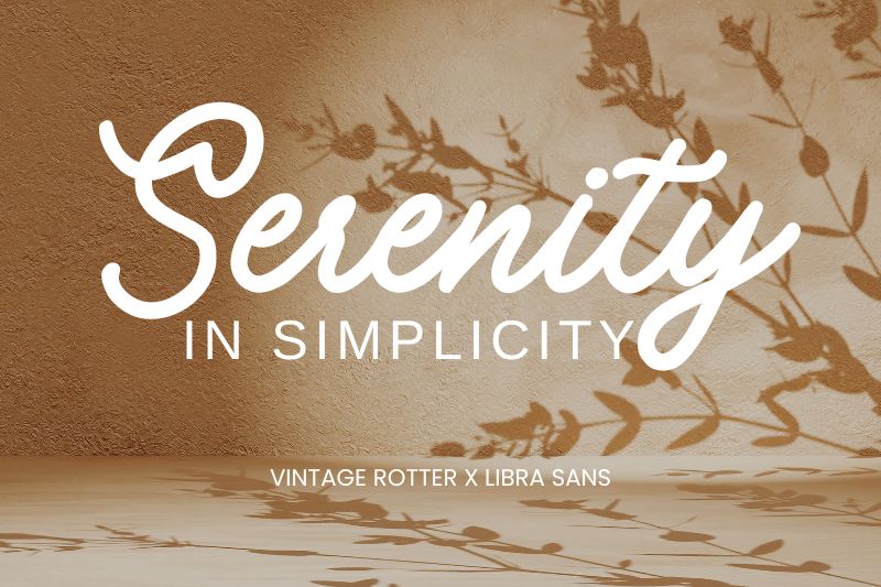
The fonts seen in the phrase “Serenity in Simplicity” are Canva font combinations of Vintage Rotter and Libra Sans. Vintage Rotter, a font designed by Din Studio, appears in the word “Serenity.” It is a monoline script font with a handwritten appearance. Its rounded and uniform letterforms give it a smooth and welcoming appearance, making it excellent for quotes, beauty product branding, and natural-themed projects.
On the other hand, “in Simplicity” makes use of the Libra Sans font, a modern sans-serif with a clean and geometrical structure. The modern and clean vibes of this font provide a contrast to the smoothness of Vintage Rotter. Furthermore, it has excellent readability, making it suitable for subheadings and body texts. The combination of an expressive script with a simple sans-serif is not only visually appealing but also conveys the content smoothly and clearly.
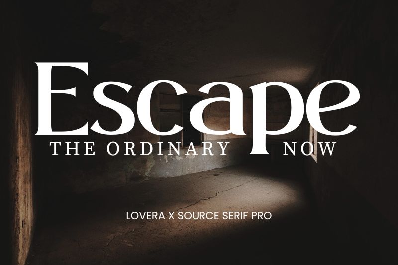
The image above shows exquisite and harmonious typography created by two Canva font combinations, Lovera and Source Serif Pro, with the text “Escape the Ordinary Now.” Lovera, the font used for the word “Escape,” is a modern serif that features bold characters and elegant curves. This font’s visual style makes it excellent for use as the main headline in projects that want to create a luxurious and expressive image, such as fashion labels, luxury branding, or exclusive promotions. Din Studio’s Font Lovera is available on our website for professional designers looking for high aesthetic value.
Meanwhile, Source Serif Pro is utilized for the text “The Ordinary Now.” This font creates visual balance with its professional and structured appearance while being comfortable to read at various sizes. The combination of expressive Lovera and tranquil Source Serif Pro provides a powerful and appealing contrast. This combination is ideal for usage in editorial design, inspiring visual advertisements, and motivational statements that stress beauty in simplicity.
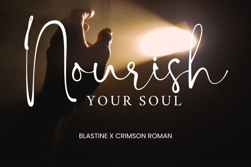
This time, there’s a blend of softness yet still classiness from two font types: Blastine and Crimson Roman, making them a perfect example of Canva font combinations. Din Studio’s Blastine font, used for the word “Nourish,” is a modern script font characterized by smooth and flowing handwritten strokes. Its feminine, soft, and light character makes it ideal for headlines or keywords that want to grab attention.
Meanwhile, Crimson Roman presents itself as a robust and easily readable classic serif. It has a slender letter structure and a shape that is proportional with balanced character spacing. Its readability makes it ideal for body text in magazines, novels, or long articles. Crimson Roman serves as a calming visual balance. The combination of the two is ideal for use in various design contexts, such as inspirational quotes that aim to appear calming yet powerful, branding for wellness or self-care products, lifestyle-themed editorials, and even aromatherapy and natural health product packaging. This combination proves that aesthetic design can also serve a functional purpose, as long as the typography selection is appropriate and consistent.
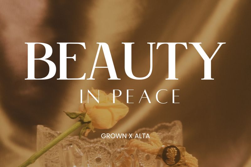
The typefaces in the image “Beauty in Peace” above are from two Din Studio and Canva font combinations, Grown and Alta. Grown, which appears in the word “Beauty,” is a classic serif with strong proportions, a high contrast between stem thickness, and graceful serifs on the letters’ edges. It is appropriate for headlines or design focal points because it is so eye-catching.
Meanwhile, in the phrase “in Peace,” a sans-serif font, Alta, is used. The characters are thin, straight, and modern, giving a clean, minimalist, and calming feel. The contrast of these two fonts creates a visual dynamic that is harmonious, exuding beauty and serenity. Together, this combination is perfect for subheadings, editorial designs, magazine layouts, social media content, or minimalist aesthetic web designs.
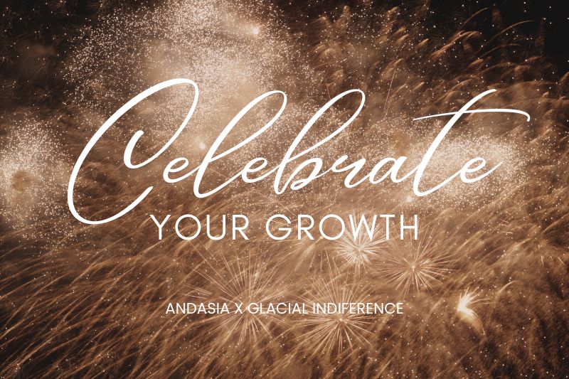
This time, the combination of the two fonts creates the effect of a discussion between the soul and mind. In “Celebrate Your Growth,” the word “Celebrate” is written in the Andasia font, a handwritten-style script font with wide curves and exquisite strokes. The style of this font conveys an expressive and intimate impression, making it ideal for use as a highlight or main element in design.
On the other hand, “Your Growth” makes use of the Glacial Indifference font, a clean, stable, and readable geometrical sans-serif. The visual contrast between Andasia’s freeform curves and the solid structure of Glacial Indifference creates a compelling harmony, making this combination great for designs that require an emotive touch. These Din Studio and Canva font combinations are ideal for greeting cards, quote designs, motivational social media content, and even personal branding that aims to be both elegant and approachable.
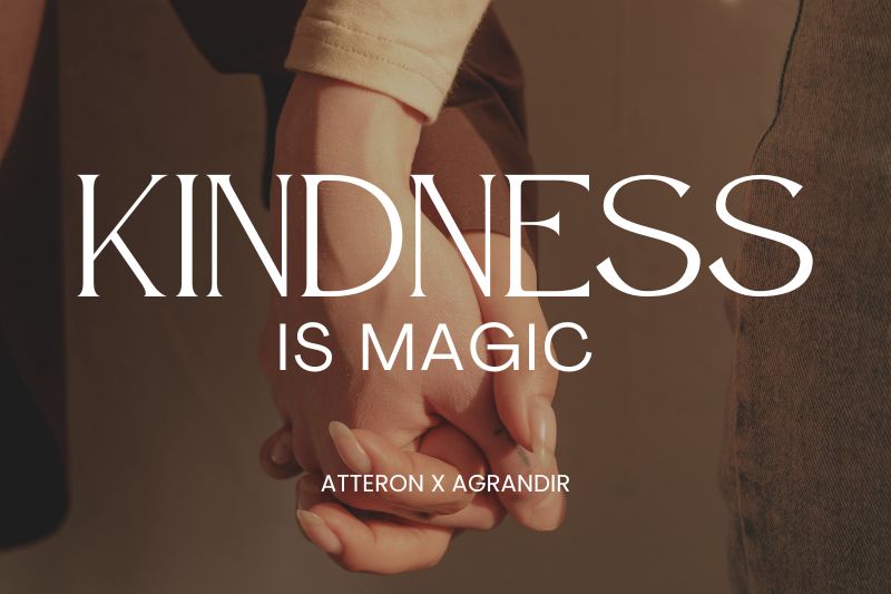
Last but not least, we’ll give you one of the best Din Studio and Canva font combinations, Atteron x Agrandir. The Atteron font, seen in the word “Kindness” above, is an artistic, contemporary serif with high contrast. The letterforms appear slender in the stems, then widen dramatically in the curves or serifs, creating a luxurious and elegant impression. This font is designed by Din Studio and can be obtained through our website. It is ideal to support design needs that prioritize an elegant and expressive appearance.
Meanwhile, the Agrandir font used in the “is Magic” is a modern sans-serif with a clean and light geometric approach. Its bold yet friendly lines make it an ideal pairing for more expressive serif fonts like Atteron. Its function in this design is to maintain readability without sacrificing overall stylistic unity. The combination of Atteron and Agrandir creates a balanced visual harmony. This combination is suitable for various design needs such as posters, fashion editorials, greeting cards, etc. Through the contrasting characters of each font, the message “Kindness is Magic” is not only readable but also emotionally touching.
Choosing the best font combination is not just about aesthetics; it’s also a crucial element in creating effective visual communication. A good font combination brings perfect balance between typography and readability to every design. Canva provides various font options, allowing users to create a balanced typographic blend between visual appeal and message clarity, especially through Canva font combinations.
By understanding the characteristics and advantages of each font in terms of shape, proportion, and style, designers can produce visual compositions that are not only visually appealing but also effectively convey the message to the audience in an impactful way. Therefore, we highly recommend exploring various Canva font combinations as part of the creative process to create strong, consistent, and professional designs.

Unlock freebies for your creative projects. Explore a curated selection of fonts, graphics, and more - all absolutely free. Don't miss out, claim yours now!
Claim Free Freebies