Summer-themed design works reflect the energy, cheerfulness, and vibrant colors synonymous with the season. To capture that spirit, font selection becomes a crucial element. Fonts with playful, bold, or brush characters are often chosen to create a fun and fresh impression. Therefore, finding the best summer fonts can be key to making your designs stand out amidst a lively and colorful atmosphere.
However, it’s important to remember that the principles of font selection apply not only to summer themes but also to all visual design contexts. Choosing fonts during the graphic design process is essential to effectively convey the design’s message. Besides being an important visual element, fonts make it easy for the audience to understand the context. Additionally, fonts can help build an atmosphere and strengthen the brand identity, especially if you pair matching fonts. You will be able to create not only an appealing but also an effective and communicative design.
Therefore, in this article, we will explore the combination of two or more fonts, commonly referred to as font pairing, with a focus on the best options for summer. When we pair two or more fonts properly, we will be able to create a visual harmony that reflects the brand identity and enhances the audience’s experience in understanding the message. Let’s dive straight into finding out the best summer fonts for your design!
Table of Contents
Font pairing is important in design because it increases readability, creates visual hierarchy, delivers design messages easily, and strengthens the brand identity. As we know, each font has a diverse personality, such as fonts that appear formal, friendly, modern, elegant, or even energetic. When two different font types are combined correctly, it will make the design more attractive and easy to understand, while if they don’t match, it will damage the design’s visuals and affect readability. Additionally, the application of font pairing aims to differentiate between titles, subtitles, and body text. Furthermore, it also aims to help the audience understand the information structure well.
Combining the right fonts will help designers avoid visual clutter and misunderstandings in their messages. That is why combining fonts is about more than just design; it is also about visual communication strategy.
Combining the best summer fonts will create visual balance and hierarchy, keeping the design neat, cohesive, and professional. The right font combination will strengthen the message compared to using just one font type. Let’s learn how to combine fonts to make your designs look more vibrant and professional.
The first step in font combination is to understand that using no more than three fonts is the best approach to preserve coherence and visual consistency while avoiding visual clutter.
Understanding fundamental font types or classes like serif, sans-serif, script, and display is important. Each has a distinct visual identity and impression. Understanding the character of each font will allow you to select a harmonious combination to establish visual hierarchy and make it easier for your audience to receive the message in your design.
A successful font combination usually involves clear yet harmonious contrast. This contrast can be achieved by combining two font types, for example, a serif font for headings and a sans-serif font for the body text. This approach makes the appearance more appealing and helps clarify the structure of the information. Additionally, font size and hierarchy are very influential in text-based design. The title, subtitle, and body text should have clear size differences so that the audience can understand the message.
To achieve an effective font pairing, we must choose the appropriate size arrangement, such as a large and bold font for the title and a smaller but more readable font for the body text. To maintain cohesion and professionalism, keep the use of fonts to a limit and ensure that they are harmonious with one another. This ensures that your design is not only visually stunning but also useful, particularly in terms of conveying the design message.
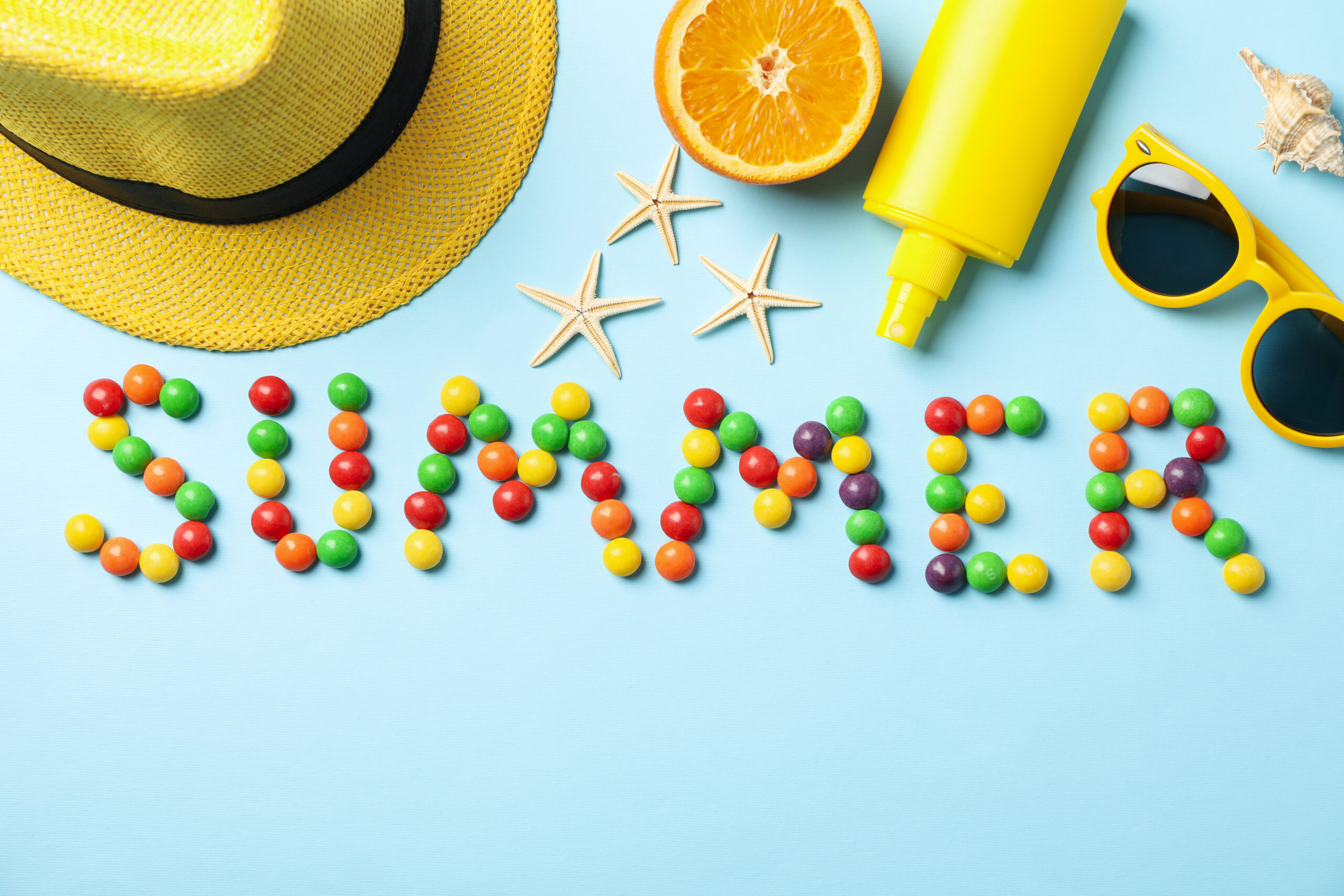
Summer is identical with bright and lively colors, positive energy, and freedom. In graphic design, the most effective way to picture the atmosphere is by choosing the font pairing with playful, chill, and fun characteristics. A font choice that is bold, rounded, and has a tropical touch would be ideal for creating summer vibes in the design that will be created. This article will provide you with inspiration for the best summer fonts and their combinations that effectively capture the essence of the season. So, let’s explore what types of fonts are suitable for your summer designs!
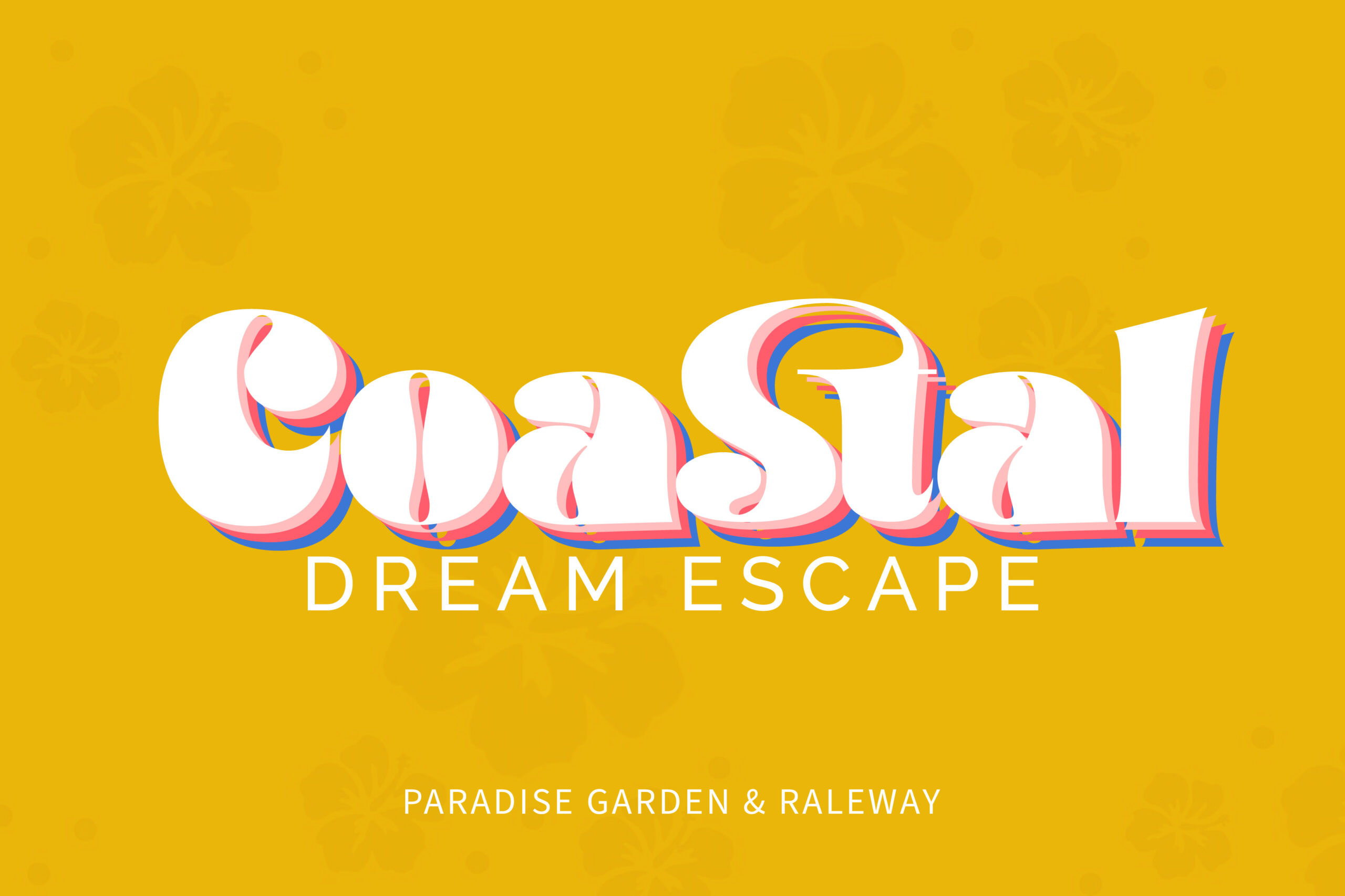
As shown in the image, the Paradise Garden font used in the word “Coastal” is a decorative serif with thick, rounded shapes. Its bold and casual appearance brings a cheerful, whimsical feel to summer-themed visuals. Key features of this font include the strong contrast between thick and thin strokes, along with vertical and horizontal hooks—small decorative touches at the ends of each letter. Paradise Garden’s eye-catching design makes it one of the best summer fonts, especially for headlines in tropical-themed designs.
Meanwhile, the phrase “Dream Escape” is displayed in Raleway, a geometric sans-serif typeface known for its clean, modern style. Raleway works well for body text or subheadings, as it delivers information clearly without overshadowing the main design elements. It pairs beautifully with display fonts like Paradise Garden, creating a balanced and visually engaging layout. While Paradise Garden stands out with its vibrant flair, Raleway’s simplicity adds a refined touch—together making them a perfect duo for your summer design projects.
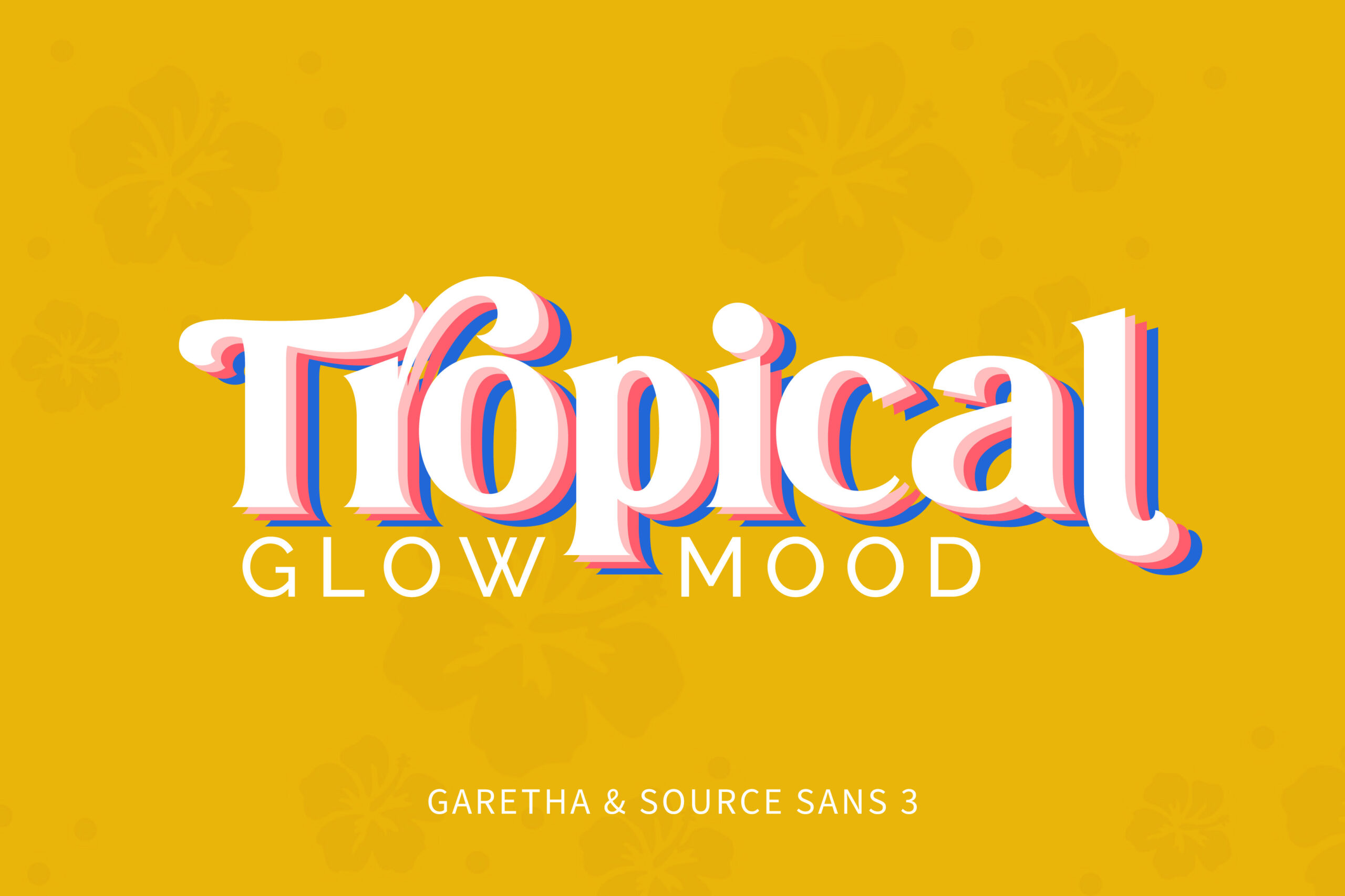
The font pairing above features a combination of two distinct fonts: Garetha and Source Sans 3. Garetha is a modern serif font with a bold, clean, and elegant appearance, while Source Sans 3 is a sans-serif font known for its simplicity, clarity, and readability. Garetha works perfectly for attention-grabbing headlines, while Source Sans 3 balances the composition with a subtle, harmonious touch.
This pairing stands out as one of the best summer fonts because it delivers a fresh, lively, and stylish impression while maintaining a professional tone. It’s especially well-suited for tropical beach themes, summer festivals, travel promotions, and other seasonal design projects that call for both flair and clarity.
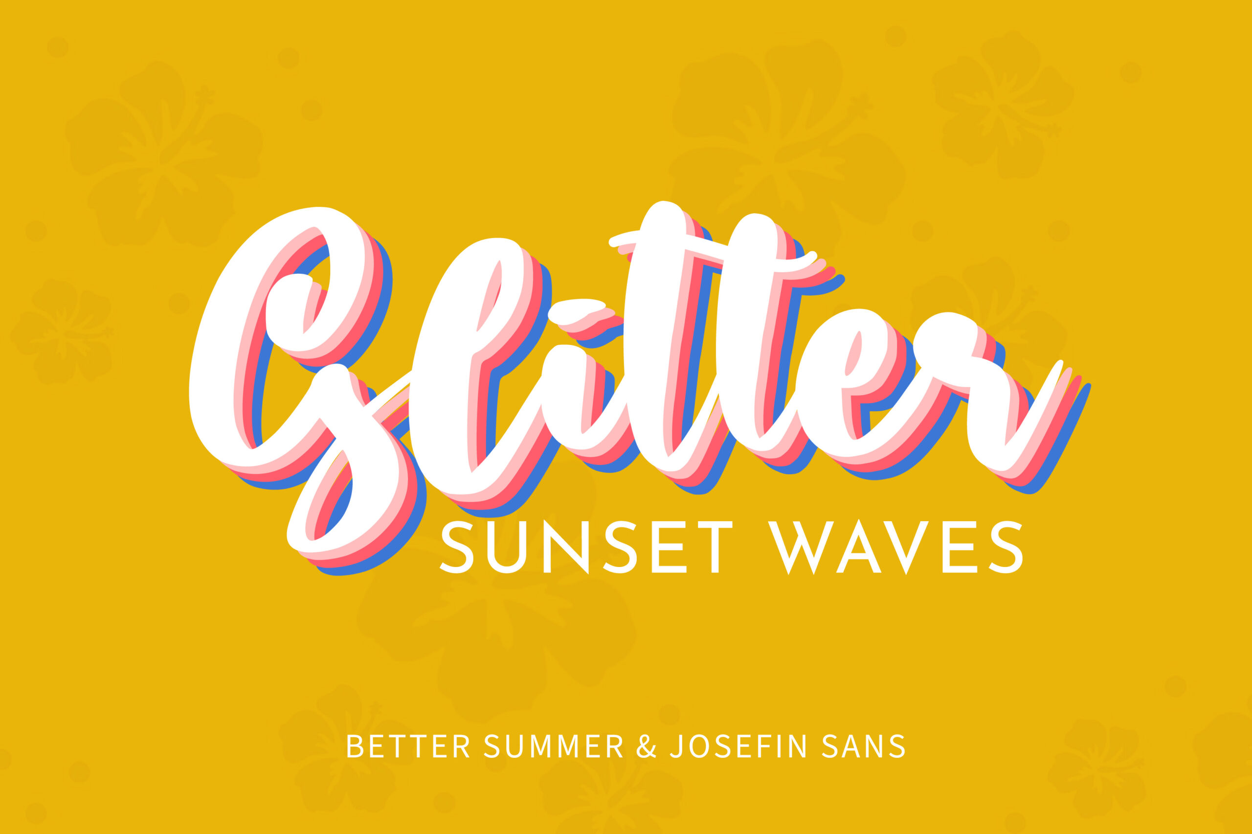
This pairing showcases two highly contrasting yet harmonious fonts when placed side by side. The word “Glitter” uses a brush script font called Better Summer, featuring flowing, dynamic, and connected letterforms. With its thick strokes and rounded shapes, the font feels bold yet warm. Thus, it is perfect for evoking a cheerful summer mood.
In contrast, the “Sunset Waves” text uses Josefin Sans, a clean and modern sans-serif font. Its thin lines, generous spacing, and minimalist style provide breathing room in the design while maintaining a sleek, contemporary look. This balance prevents the layout from feeling overcrowded.
Together, the pairing of Better Summer and Josefin Sans forms one of the best summer fonts, offering a refreshing, playful vibe while still keeping the overall design structured and easy to read.
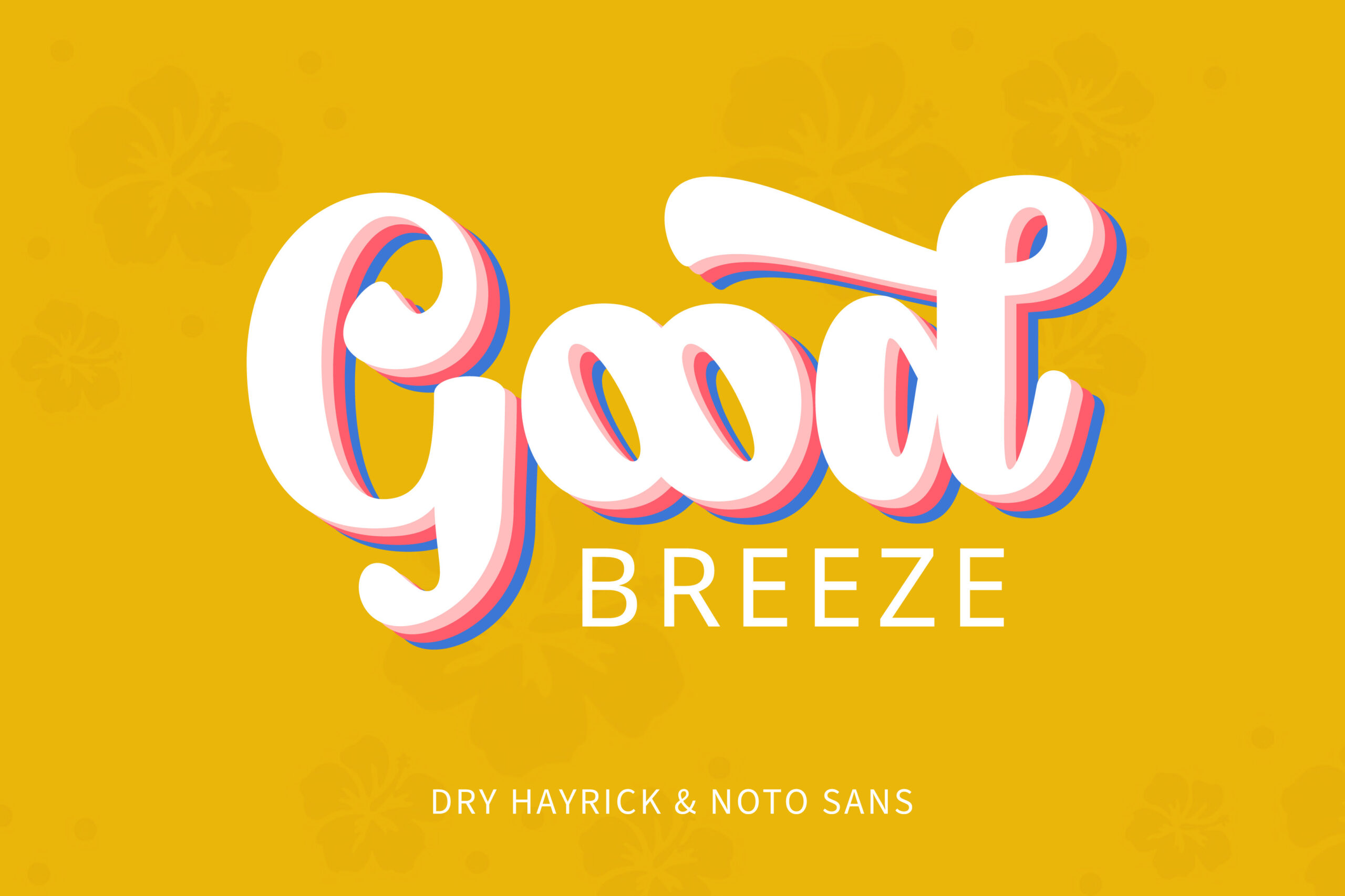
This font combination features Dry Hayrick and Noto Sans, two contrasting fonts that work surprisingly well together in summer-themed projects. The design features the word “Good” in the main title, which uses Dry Hayrick, a display font with script brush characters that are both flexible and artistic. Its bold and expressive strokes, combined with unique ligatures and stylistic alternates, create an impression. Therefore, this font is ideal for capturing a relaxed, sunny vibe.
Meanwhile, the word “Breeze” is set in Noto Sans, a minimalist sans-serif font known for its clean, undecorated letterforms. Its neutral tone and excellent readability offer a modern touch and balance out the bold personality of Dry Hayrick.
This pairing stands out as one of the best summer fonts because it demonstrates how contrasting typefaces can complement each other, creating a design that feels both dynamic and harmonious. Together, they are perfect for everything, from personal branding to promotional visuals.
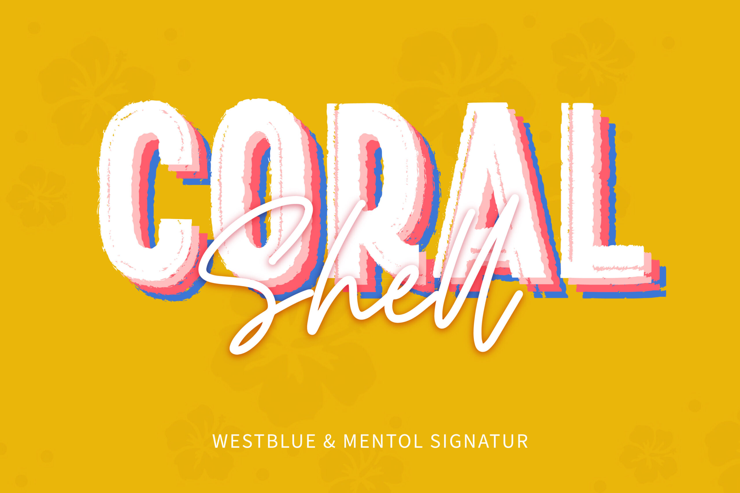
The combination of these two fonts proves the stylistic contrast between bold and script can create pleasing visual harmony. The word “Coral” uses the Westblue font, a display sans-serif with bold characters and intricate brushwork. This font is often used as a headline because it can capture attention with its bold, straightforward letterforms and unique brushstrokes. Westblue evokes a sense of summer joy, as if depicting strokes on a surfboard or a beach festival.
The subtitle “Shell” comes from the script-type Mentol Signature font. It has an elegant and precise monoline character, which creates a natural impression in the designs you create. As a subtitle, Mentol Signature is an intriguing choice to enhance the visual appearance of your designs and make them look more elegant. This font is perfect for summer-themed designs because of its smooth, elegant, and precise curves.
Together, the Westblue and Mentol Signature pairing becomes one of the best summer fonts, balancing bold expression with subtle elegance and making them perfect for summer-themed visuals that aim to be both lively and polished.
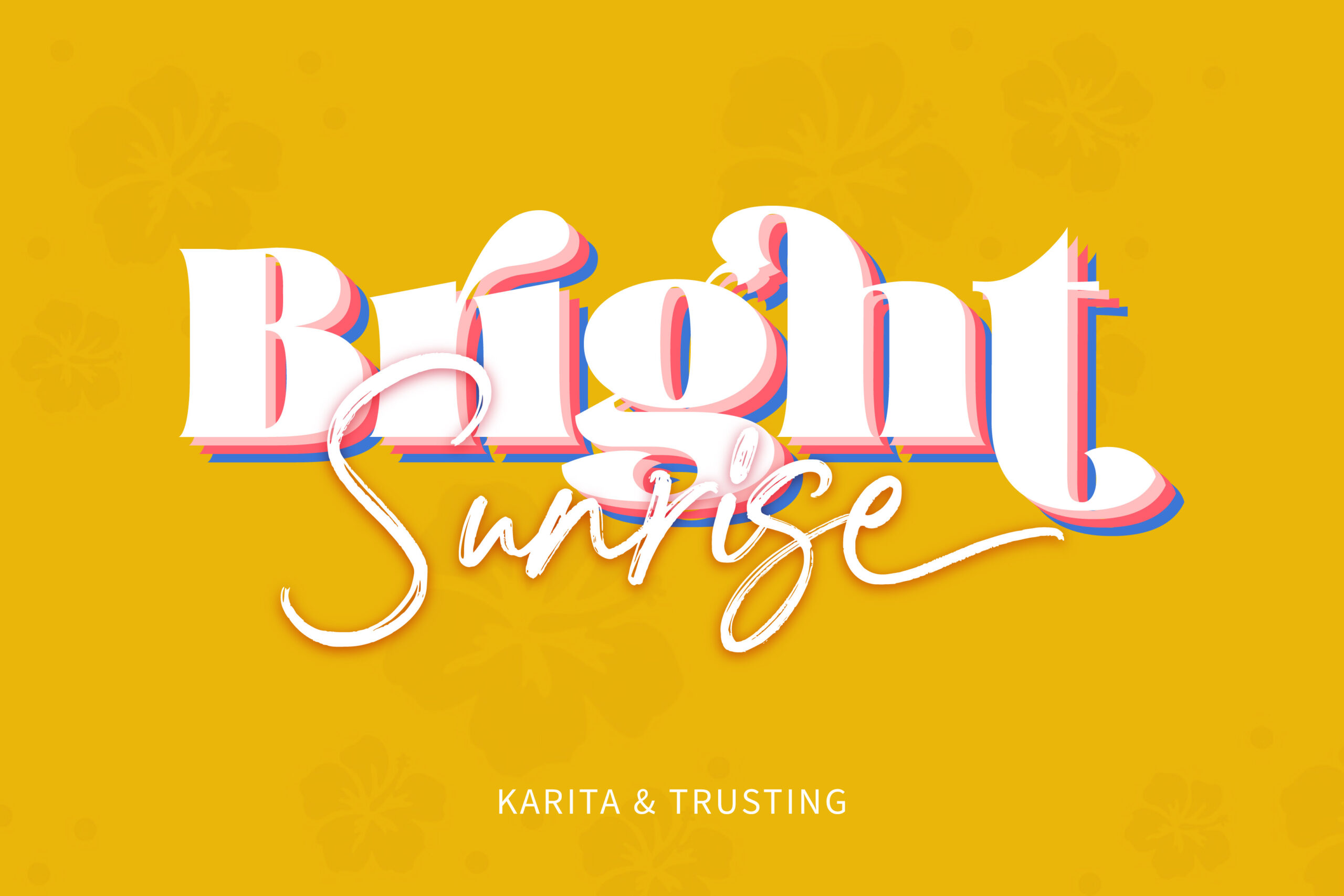
The next ones on the combination list of best summer fonts are Karita and Trusting. This combination results in a visual composition brimming with summer happiness. The text “Bright” is in the Karita font, a serif display with a bold and traditional appearance. Its key distinguishing elements are the extreme contrast between thick and thin areas, as well as the acute serif shape, which appears rounded in some places. This font is commonly used in headlines due to its dominance and readability.
Meanwhile, the Trusting font used for the term “Sunrise” is a cursive script with striking brush details. Each curve mimics a brushstroke or informal handwriting, resulting in a warm, personal, and free impression. This font has a summery vibe, reminiscent of writing on holiday postcards or sketching spontaneous doodles in beach sand. Trusting retains a strong visual character because of its rather thick strokes and slightly slanted writing style.
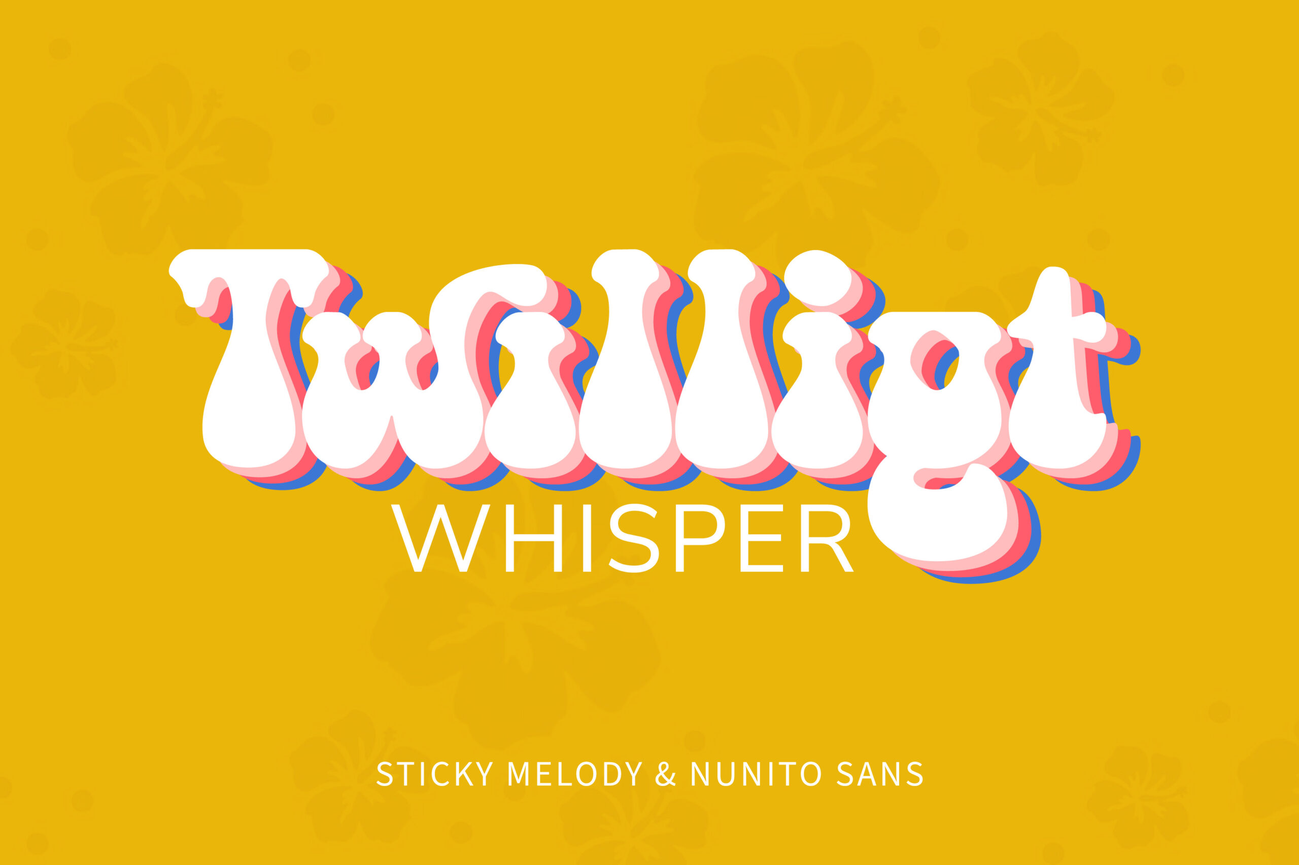
This poster, featuring the title “Twilight Whisper,” showcases a striking combination of Sticky Melody and Nunito Sans—a pairing that blends the essence of summer with dynamic, modern typography. The word “Twilight” is styled in Sticky Melody, a playful display font with bubbly, liquid-like letterforms. Its dripping, rounded shapes evoke a carefree, fun-loving vibe, making it perfect for eye-catching summer headlines that convey energy and spontaneity.
Balancing that boldness, Nunito Sans appears in the word “Whisper” with a sleek, clean sans-serif style. When used in lowercase with loose spacing, it provides excellent readability and a structured visual hierarchy. This thoughtful pairing proves that stylistic contrast can enhance a design’s overall impact, making Sticky Melody and Nunito Sans one of the best summer font combinations for vibrant posters, event graphics, and seasonal branding.
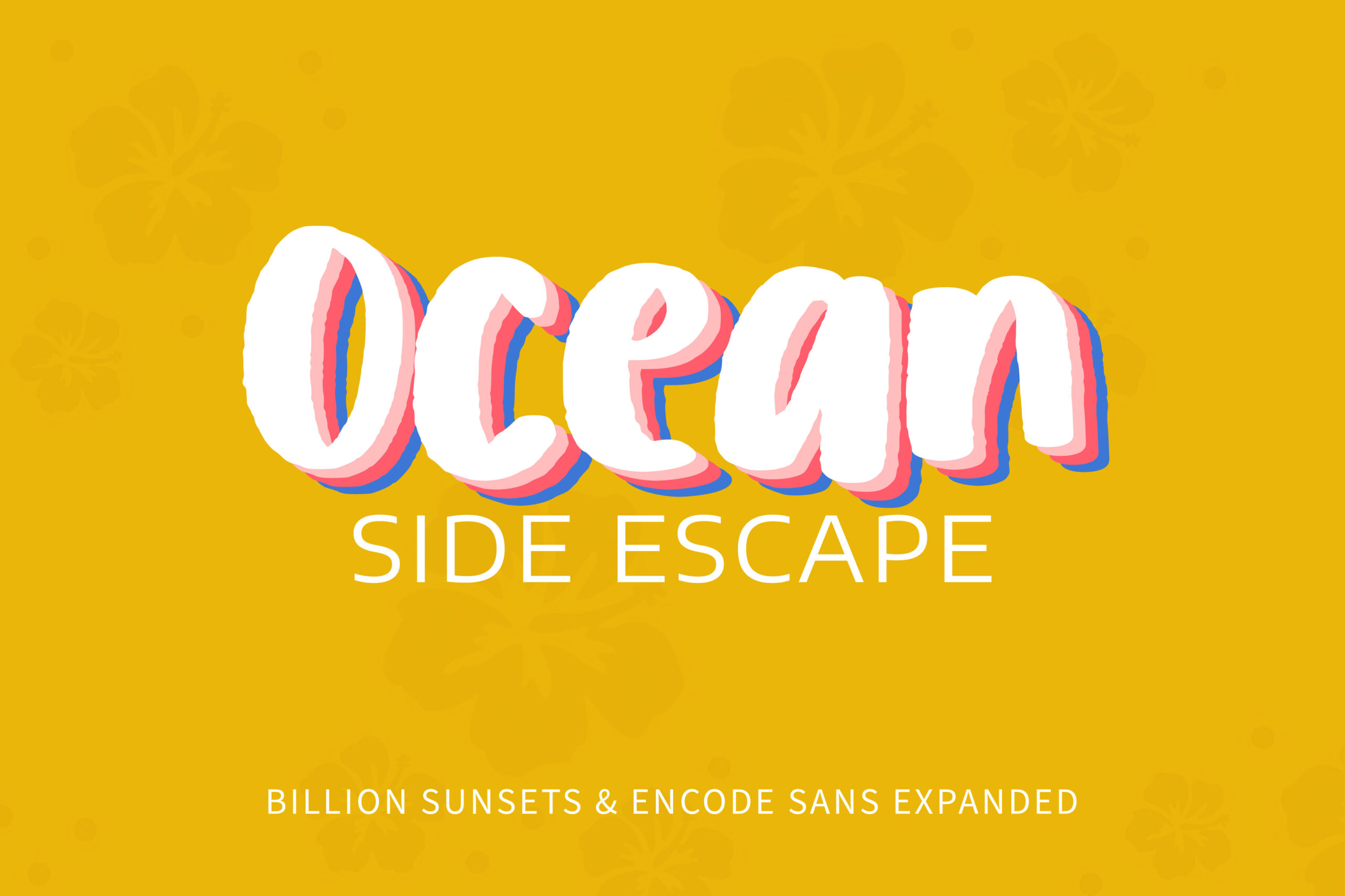
Now we are talking about the Billion Sunsets and Encode Sans Expanded. This font combination is included in the list of best summer fonts due to its ability to evoke an atmosphere reminiscent of a joyful beach experience and the whimsical essence of summer. The artistic character and organic form of the font create a strong and captivating impression.
As a counterpoint to the main Billion Sunsets font, Encode Sans Expanded offers a clean and tidy sans-serif appearance. The expanded version of this font provides a sense of spaciousness and flexibility, creating a harmonious visual contrast. This font is incredibly readable, making it ideal for supporting text, such as subtitles or taglines. The use of capital letters for all letters also provides a unique visual blend of warmth and precision without disrupting the design’s headline. The overall look, which comes from a blend of Billion Sunset and Encode Sans Expanded, successfully reinforces the summer atmosphere.
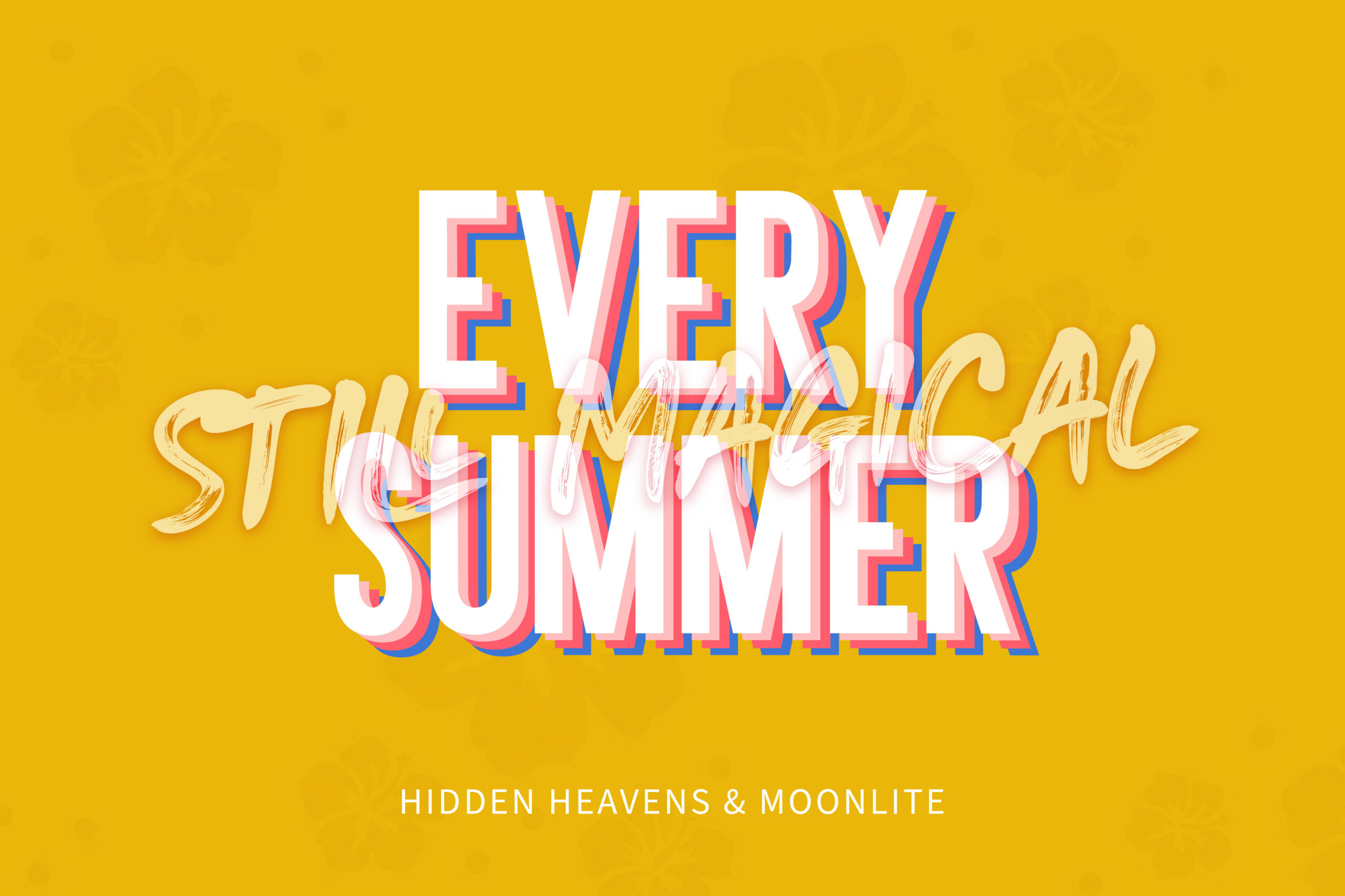
The font combination in the “Every Summer Still Magical” design may appear playful at first glance, but a closer look reveals a harmonious blend of two distinct typographic styles. The main font, Hidden Heavens, is a bold sans-serif typeface presented in all capital letters. Its strong, geometric structure ensures high readability, even from a distance, making it an excellent choice for impactful summer headlines.
Complementing it is Moonlite, a brush script font used in the supporting text. Its fluid, hand-drawn strokes add a personal, artistic touch—resembling the soft flow of watercolor on paper. While Hidden Heavens brings a modern, structured feel, Moonlite introduces warmth and organic movement. Despite their contrasting characteristics, the pairing works beautifully, creating a beautiful combination of the best summer fonts for designs that aim to be both bold and expressive.

Unlock freebies for your creative projects. Explore a curated selection of fonts, graphics, and more - all absolutely free. Don't miss out, claim yours now!
Claim Free Freebies