In an increasingly competitive visual design era, typography should not be something you consider as a complementary element; rather, it is a part of the strategy to build effective visual communication. Selecting and pairing fonts in the right way will affect the audience’s perception of a brand, product, or the message behind them. In this context, a modern font pairing is a good typography approach that puts emphasis on balance between contemporary aesthetics and readability.
The application of a modern font pairing in a design requires a thorough understanding of the character of each type of font. If the combination is not harmonious, the design will look inconsistent, making the main design message unclear. That’s why creating a modern font pairing is not just about visual taste, but it should be a part of your structured, organized design plan.
Through this article, we will explore a modern font pairing top list that is not only visually appealing but also functional in various media. This approach helps build a consistent visual identity that is in line with the contemporary design trends, strengthening the delivery of the design message clearly and in a professional manner.
Table of Contents
Link of font demo: Click Here
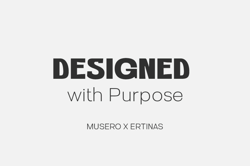
Having a prominent contrast between thick and thin letterings, this pairing results in a directed visual balance. The Musero font in the text “DESIGNED” has a bold, strong, and geometrical visual weight. Its solid and clean letterforms create a sense of modernity and strength in message delivery. Musero is unique thanks to its purposeful, varied letter proportions with dynamic visual rhythm, making it easy to attract attention while maintaining its readability in big-sized media.
On the other hand, Ertinas is used as the supporting font for informational texts. This font has a lighter, thinner, and more minimalist character, functioning as the visual balance for the Musero font. Its superiority relies on its lettering simplicity and wide spacing, which maintain the comfort of the reading flow. Together, they become a modern font pairing that is effectively applicable in professional and structured design.
Link of font demo: Click Here
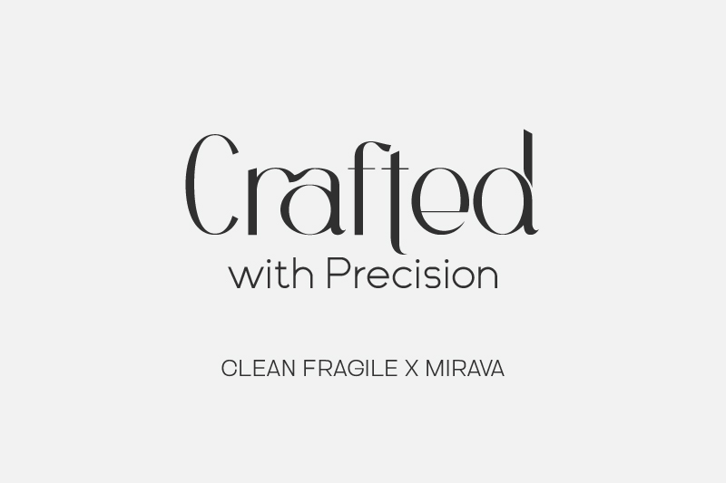
Introducing the modern font pairing of Clean Fragile and Mirava, a pairing that emphasizes precision and visual clarity. Clean Fragile is used as the main font with modern serif characters. It looks thin, elegant, and full of details. Its letterforms are artistic and exclusive at the same time, making it effective at attracting attention and strengthening the visual identity of the main text.
As Clean Fragile’s complementary font, Mirava is a sans-serif font with a clean, simple, and readable trait. Its neat letter structure as well as consistent spacing help maintain the comfortable reading flow. The contrast between expressive Clean Fragile and functional Mirava creates a modern font pairing that is not only harmonious and professional but also relevant for many contemporary design needs.
Link of font demo: Click Here
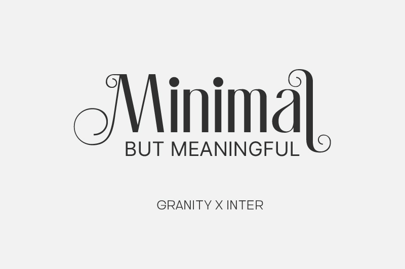
The design above emphasizes its visual focus by utilizing two fonts, each with distinct characters that feel well-directed. Granity’s serif-decorative character, with smooth curves and carefully organized ornament details, expresses itself strongly visually. These characters provide incredibly valuable aesthetics, letting the main text stand out and be characterized without sacrificing clarity.
The secondary font, Inter, strengthens the visual stability. Inter is a modern sans-serif font with geometrical structure, balanced proportion, and consistent spacing. Inter maintains readability and the information flow in various text sizes. The combination of the expressive and decorative Granity font with the functional boldness of Inter creates a modern font pairing that is well-balanced, ensuring that the visual character and message clarity work harmoniously in a professional design composition.
Link of font demo: Click Here
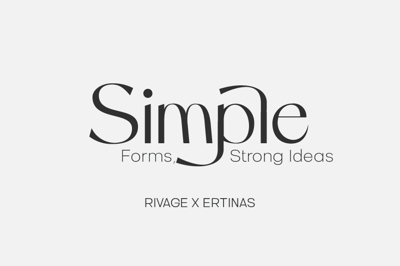
The design above leverages typography as the source to simplify the shape without reducing the power of the message, simultaneously implementing the modern font pairing principles in a measured manner. Rivage, the font used for the headline, has smooth, curved characters and varied thickness contrast. Those characters present an elegant and classy impression, making the title stand out with a strong visual value.
Ertinas, on the other hand, is the font that strengthens the message clarity, thanks to its minimalist letterforms and clean, light structure. The relationship between Rivage’s expression and Ertinas’s simplicity creates a modern typography that feels efficient, professional, and consistent in delivering the message clearly.
Link of font demo: Click Here
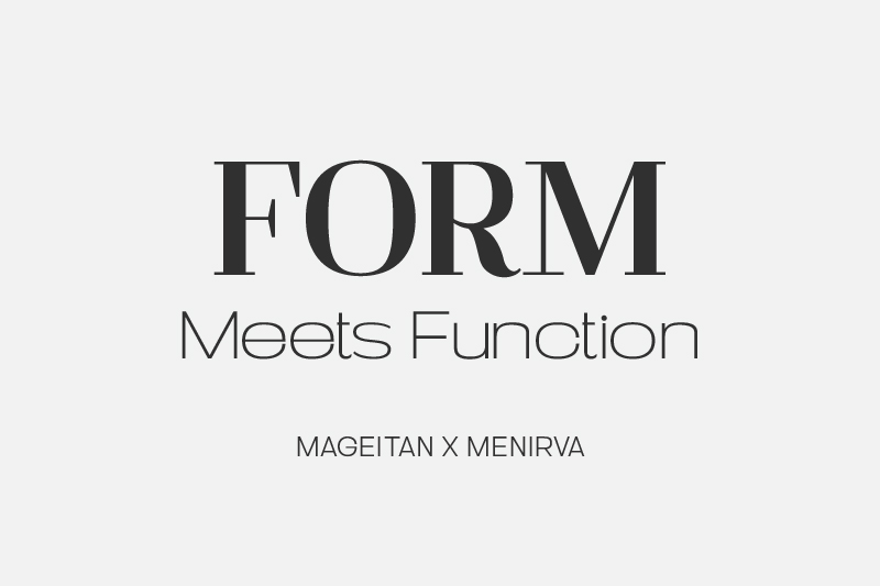
Mageitan functions as the primary font, as seen in the text “FORM,” with letterforms that are clearly bold and contrasty. Each shape is arranged in a solid and proportional manner, resulting in a visual that appears both robust and controlled. This font stands out for its ability to convey a formal impression while remaining relevant in the context of modern design.
On the other hand, we have Minerva as the supporting font used in the text “Meets Function.” It is a modern sans-serif with a simple and clean impression. Its neat letter structure and balanced proportion help enhance readability in various text sizes. Minerva is a functional and neutral font, making it possible to use it as support for the main message effectively without distracting the audience’s attention from the title.
Link of font demo: Click Here
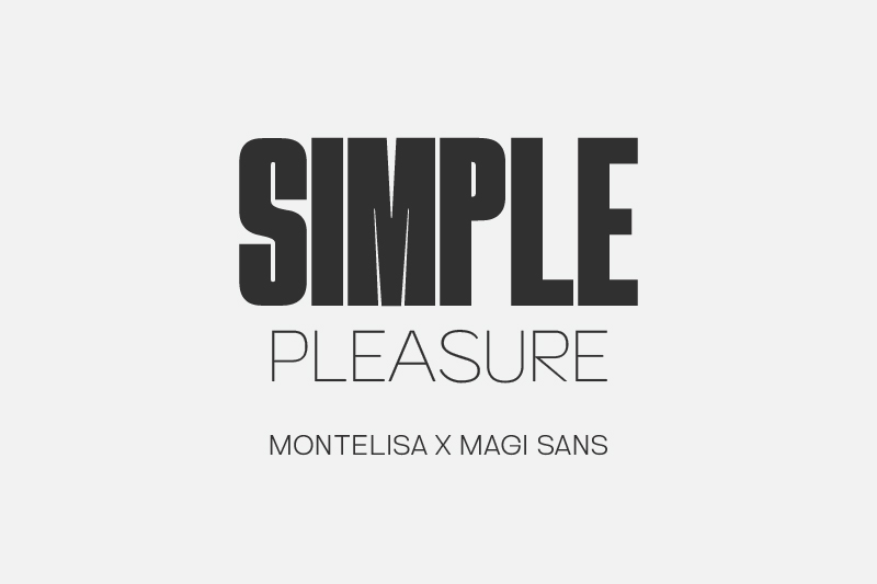
The visual impact of this composition is created by combining striking and complementary contrasting fonts. Montelisa is the primary font used in the title “SIMPLE.” Its letter character is robust, solid, and well-constructed. Montelisa’s geometric shape has a dramatic proportion that conveys a sense of bravery and stability, making the title stand out as the focus of attention while stressing the modern font pairing concept as the visual identity.
On the other hand, the Magi Sans font used in the word “PLEASURE” has a simple, clean, and proportional letter character. The spacing between each letter is also carefully designed, resulting in great readability at varied font sizes. Its notable characteristic is its visual flexibility and neutral standing, which supports the information hierarchy by not competing with the dominant Montelisa.
Link of font demo: Click Here
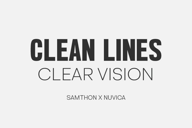
Samthon is the foundation of this design’s typography. This font has a bold, solid, and structurally controlled letter character. It works perfectly as a title font because of its dominant vibe that evokes a sense of modernity and functionality. The straight lines and stable proportion of the Samthon font strengthen the neat and professional impression.
As a counterbalance, Nuvica’s slim and clear letterforms provide a softer visual approach. This character is highly readable, particularly with supporting text in smaller sizes. Nuvica’s neutral and practical nature makes it adaptable to various design contexts, while Samthon’s dominance provides a visual counterpoint. The combination of these two fonts creates a modern font pairing system that values structural clarity, visual efficiency, and display consistency.
Link of font demo: Click Here
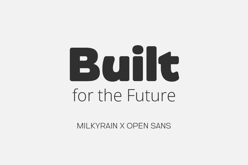
MilkyRain presents a dominant vibe in the text “Built” seen in the design above. Its bold, rounded, solid letterforms, complete with smooth letter ends, create a strong, stable, and futuristic impression. These characters strengthen the primary design message because of its high visual appeal. It is effective as a headline font that emphasizes the concept of power and readiness in facing the future.
Open Sans, used in the text “for the Future,” is also the informative supporting element. This font is a clean, light, and neutral sans-serif font with balanced proportions and excellent readability. Its humanist and consistent trait makes it easily applicable in various media, including digital and print ones, without sacrificing the message clarity.
Link of font demo: Click Here
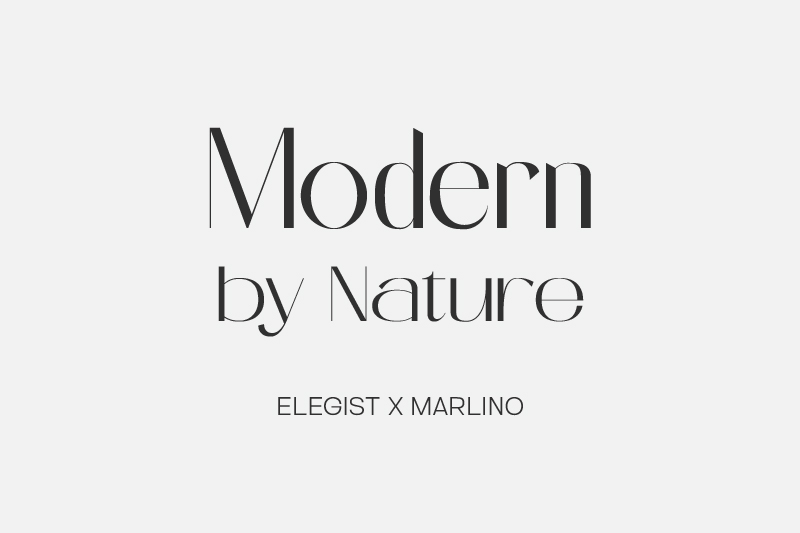
The last modern font pairing idea in this list is Elegist x Marlino. Elegist is a sans-serif font with slim and smooth contrast that has sharp and clean letter-end details, creating a sense of elegance without losing its contemporary nuance. The distinctive feature of this font is in its ability to balance the classic and modern character, creating a classy, controlled, and relevant appearance for the title.
Meanwhile, Marlino, the secondary font used in the design above, stands out with its modern sans-serif style. Its letter structure is stable, proportionally balanced, and cleanly shaped. Marlino’s distinctive feature is in its design’s consistent simplicity, producing a high readability level for various text sizes. This font’s neutral and functional character makes it effective as supporting text, as it can maintain information clarity and strengthen the visual composition without diminishing the dominance of the main font.
Using a modern font pairing helps create effective, balanced visual communication between characters while enhancing readability. Thoughtful font selection and combination should consider elements that strengthen design identity, maintain visual consistency, and communicate messages clearly and professionally across a range of modern design contexts.
Designers can create typography that is in sync with new design trends by knowing characters and the distinctiveness of each style of font. Well-planned modern font pairing implementation in a design encourages the production of communicative, appealing designs with long-term and relevant values.

Unlock freebies for your creative projects. Explore a curated selection of fonts, graphics, and more - all absolutely free. Don't miss out, claim yours now!
Claim Free Freebies