
Overlapping Font Pairing Guide for Strong Typography Design
In the advancement of modern typography, visual exploration does not only focus on font selection but also on how to combine them. One of the popular techniques is overlapping font pairing, which is a method that combines two types of fonts with some overlapping letter elements to create a more attractive visual emphasis. This technique usually mixes font script with font serif, resulting in a harmonic visual contrast.
The use of overlapping font pairing allows the designer to create an elegant, dynamic, and modern atmosphere in one composition. By adjusting the right proportions, thicknesses, and visual rhythms, designers can create a complementary font combination. These advantages lead to the widespread application of this style in poster titles, brand visual identities, and editorial designs, which demand an artistic yet professional appearance.
This article will discuss the overlapping font pairing examples that can strengthen the visual character for various design needs. Through a proper combination of font selection, readers can understand how this technique helps create a more attractive and communicative composition.
The Selection of Overlapping Font Pairing for Various Design Needs
Combining two types of fonts through the overlapping technique is not solely about piling up letterforms but about creating a complementary visual dialogue. Each font pairing has a different character and function, making it important to consider the selection of letter structure, visual rhythm, and the goal of design communication. Here are some of the overlapping font pairing styles that can be your design reference.
Bavaria Gates x Equestrian Style
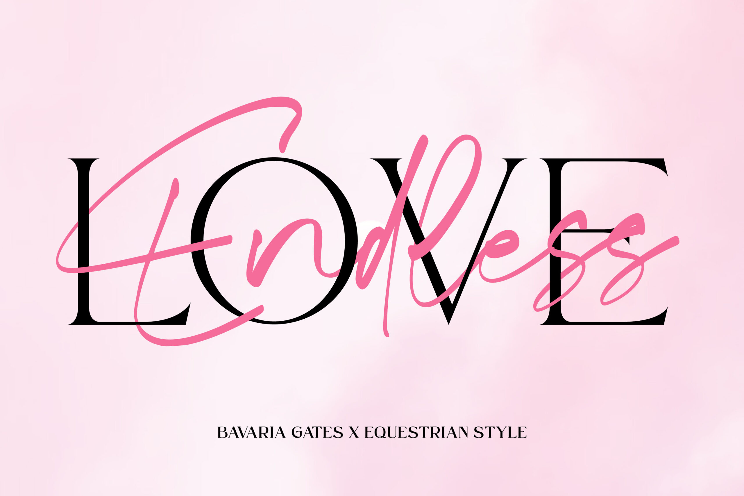
A strong visual contrast becomes an effective technique for applying overlapping font pairing. The combination of Bavaria Gates and Equestrian Style serves as a clear example of the principle. Bavaria Gates is a handwritten script font characterized by flexible strokes, long lines, and swash variations that create an expressive impression.
On the other hand, Equestrian Style presents a serif font with a firm, proportional, and readable letter structure. The organic flow in Bavaria Gates serves as the dynamic accent that flows over the serif form of Equestrian Style, while the solid structure maintains the legibility, even though some of the letter elements overlap each other.
Florako x Bluewind
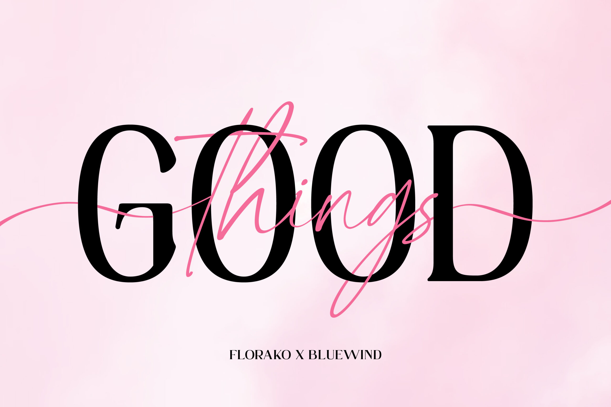
In the world of typography that is full of visual exploration, the combination of Florako and Bluewind becomes an interesting example of how two different characters can be unified harmoniously. Florako, as a serif font, has a bold letter structure and stable proportion, and it acts as a sturdy base element that maintains readability in an overlapping composition.
As the pairing, Bluewind presents a light, flowy, and expressive script font, giving a dynamic decorative accent without disturbing Bluewind shape of the letter. When applied with the overlapping font pairing technique, Bluewind organic line passes smoothly over Florako’s bold letters, creating a balance between structural strength and aesthetic touches that enrich the overall look.
Castre x Fancy Glow
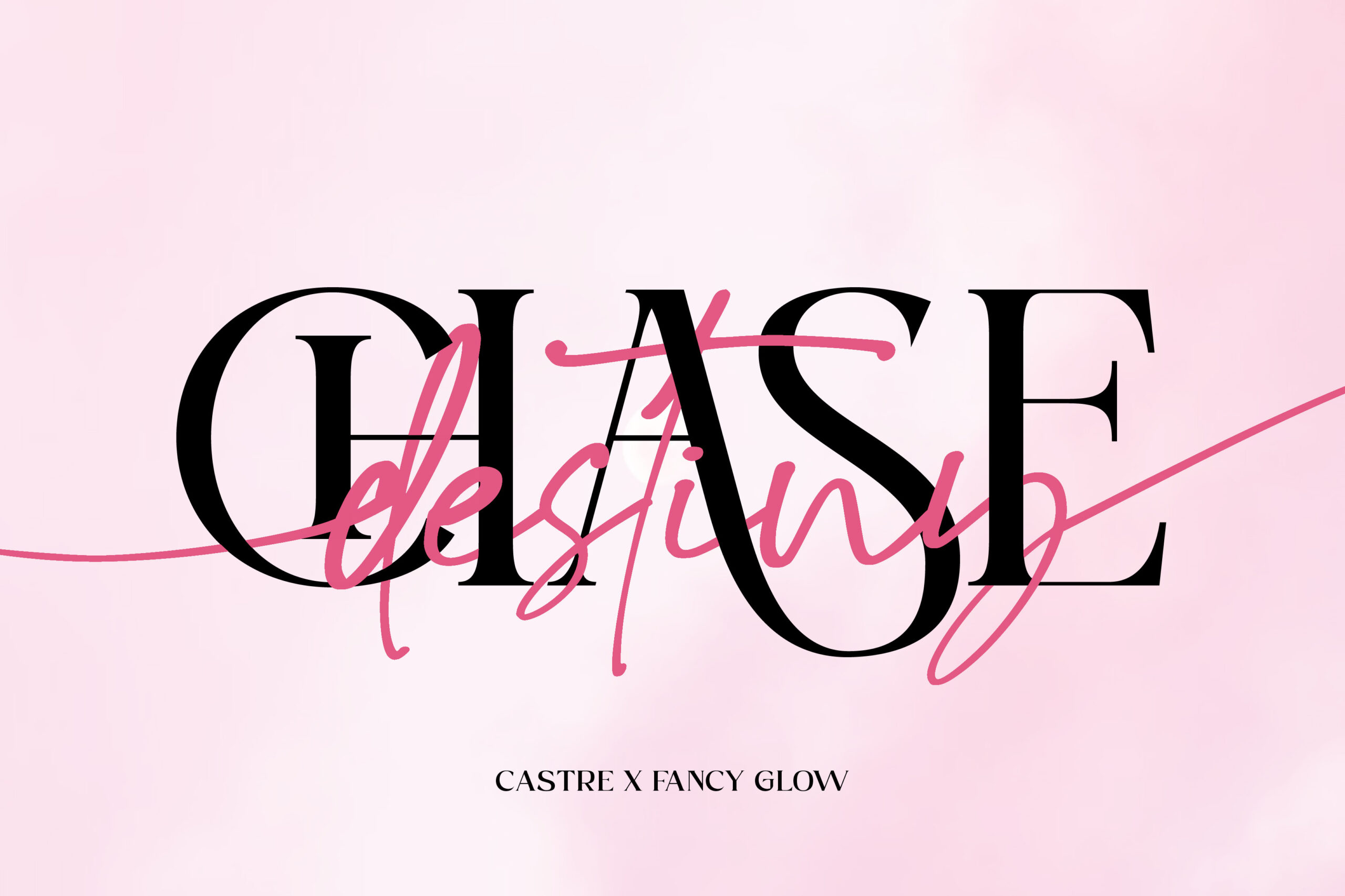
To understand the effectiveness of the overlapping technique in typographic design, a clear contrast font pairing is needed. Castre is a serif font with a tall, slender, and strong thick-thin contrast letterform. The soft but firm serif’s structure makes a stable visual foundation in a typographic composition.
Meanwhile, Fancy Glow serves as a decorative accent that moves freely on the serif’s elements. This font has a long, curved flow stroke and an expressive handwritten rhythm. When applied in an overlapping font-pairing technique, the layers of Fancy Glow script pass between the bold characters of Castre. This interaction creates a harmonious visual contrast, blending the strength of the serif structure with the organic flow of handwriting.
Equity x Brighter Miracles
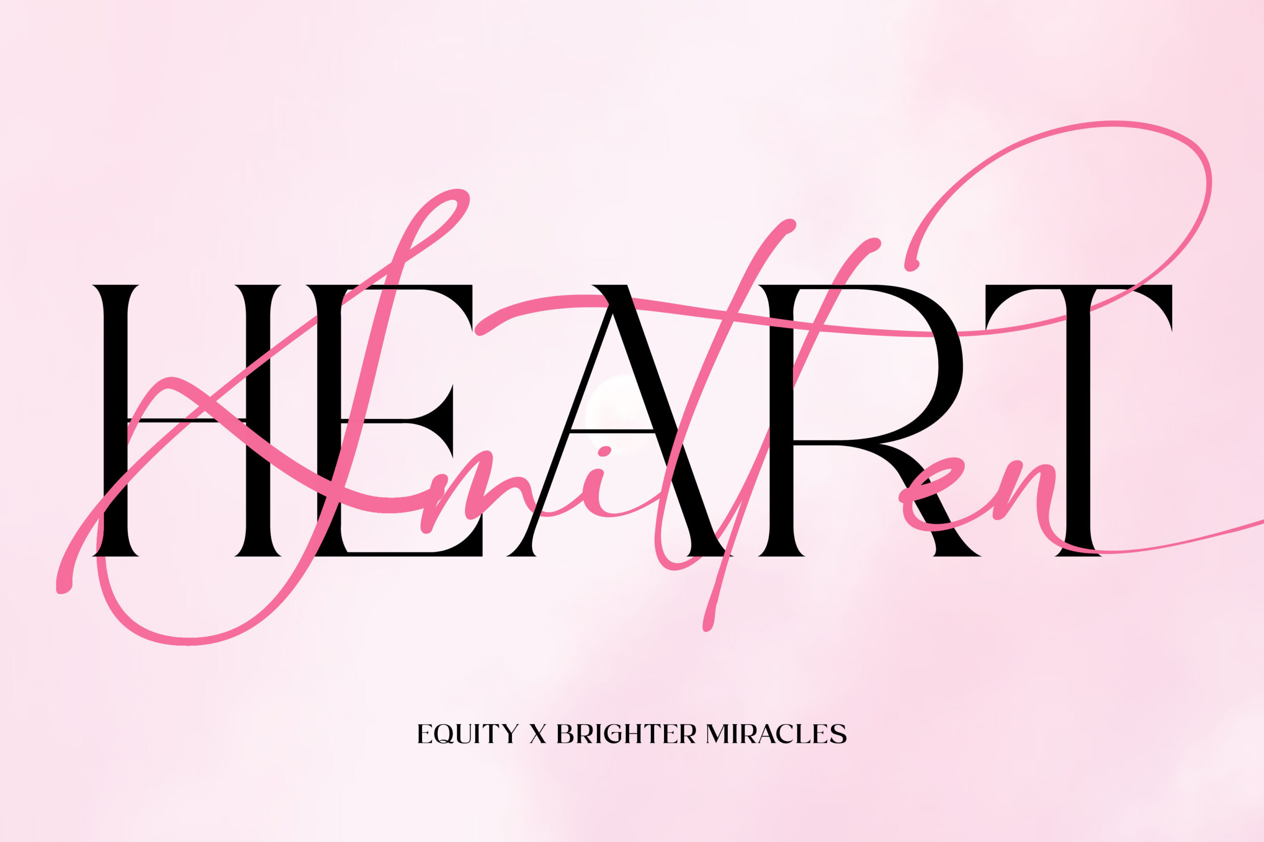
This time, the combination of Equity and Brighter Miracles becomes one of the most standout and interesting pairing examples. Equity is a serif font with a slim, thickness contrast and a clean line structure letterform. Its visual character gives an elegant, stable, and professional impression. The balanced serif’s proportion makes it easy to read and stand out as the main typography element.
Meanwhile, Brighter Miracles employs a modern script with a long and curved stroke, characterized by an expressive handwriting rhythm. The distinction lies in the smooth curve and organic movement, which give an emotional and decorative touch. This overlapping font pairing creates a strong visual contrast, resulting in a depth of appearance without reducing readability.
Konfista x Markingmate
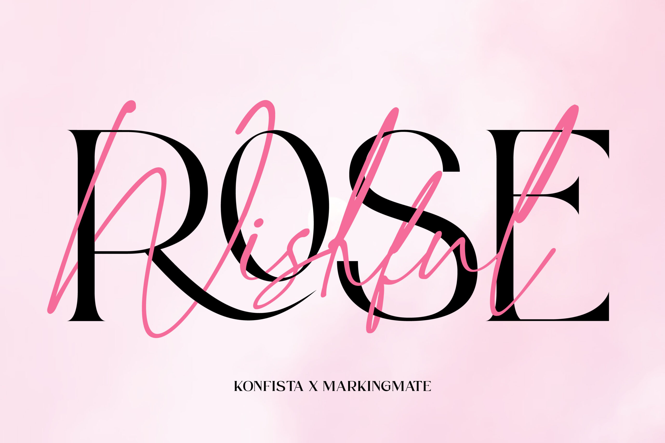
This overlapping font pairing becomes an effective technique when two fonts complement each other. The combination of Konfista x Markingmate gives a clear example of overlapping font pairing implementation, which unifies the serif structure and script’s gesture harmoniously. Konfista has a slim, thick contrast and soft serif detail that functions as a strong visual foundation but is still easy to read.
Markingmate, as Konfista’s pair, offers a soft stroke, an organic curve, and an expressive handwritten letterform. The freer and more fluid style provides a personal and decorative nuance. The combination of both creates a balanced, dynamic, and aesthetically more attractive visual composition.
Myflora x Funtime Notes
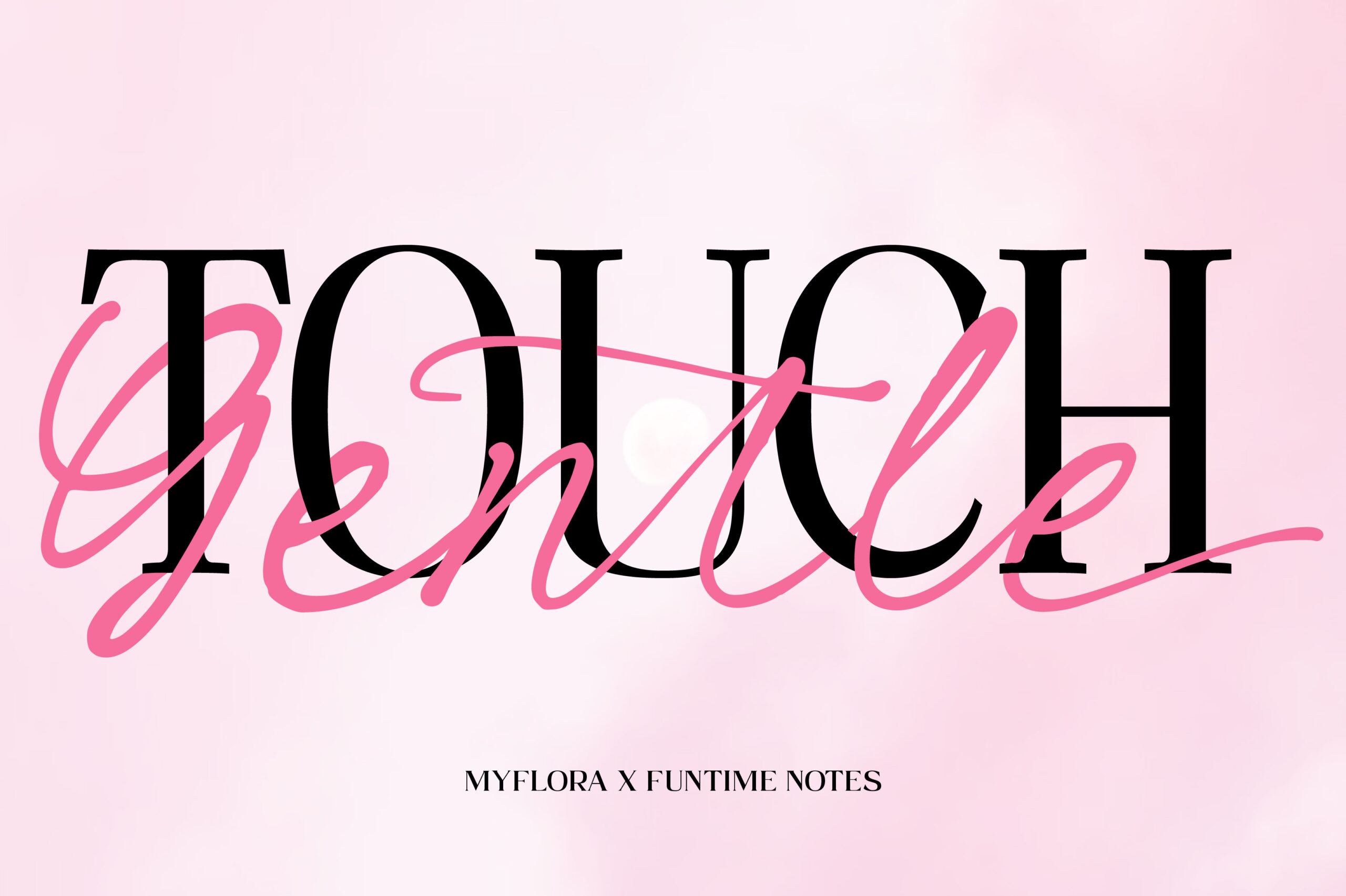
The combination of Myflora and Funtime Notes serves a soft, but still firm, visual harmony, making it ideal for overlapping technique. Myflora has an organic brush stroke, soft curve, and an elegant handwritten rhythm, creating a feminine and natural impression.
On the other hand, Funtime Notes comes as a serif, which is stable and structured. It is easy to read because of its neat and light contrast proportion. Both fonts create a complementary pairing because Myflora serves as a decorative accent, while Funtime Notes offers a strong typographic foundation. Therefore, this combination creates a balanced, aesthetic, and clear visual appearance.
Refinest x Clearstone
The combination of Refinest and Clearstone provides a unique approach in visual layering, where both complement each other in creating the depth of the typography. Refinest has a firm but smooth letterform, giving a premium, neat, and professional impression. The main distinction lies in the elongated and refined look of the letter proportion, making it appealing as a stable and easy-to-read main typography element.
On the other hand, Clearstone, with a fluid line, organic curve, and an expressive handwritten rhythm, shows more flexible and personal characteristics. The uniqueness lies in the dynamic stroke variation, adding energy and warmth to the design as a visual accent.
Mirola x Stealing Hearts
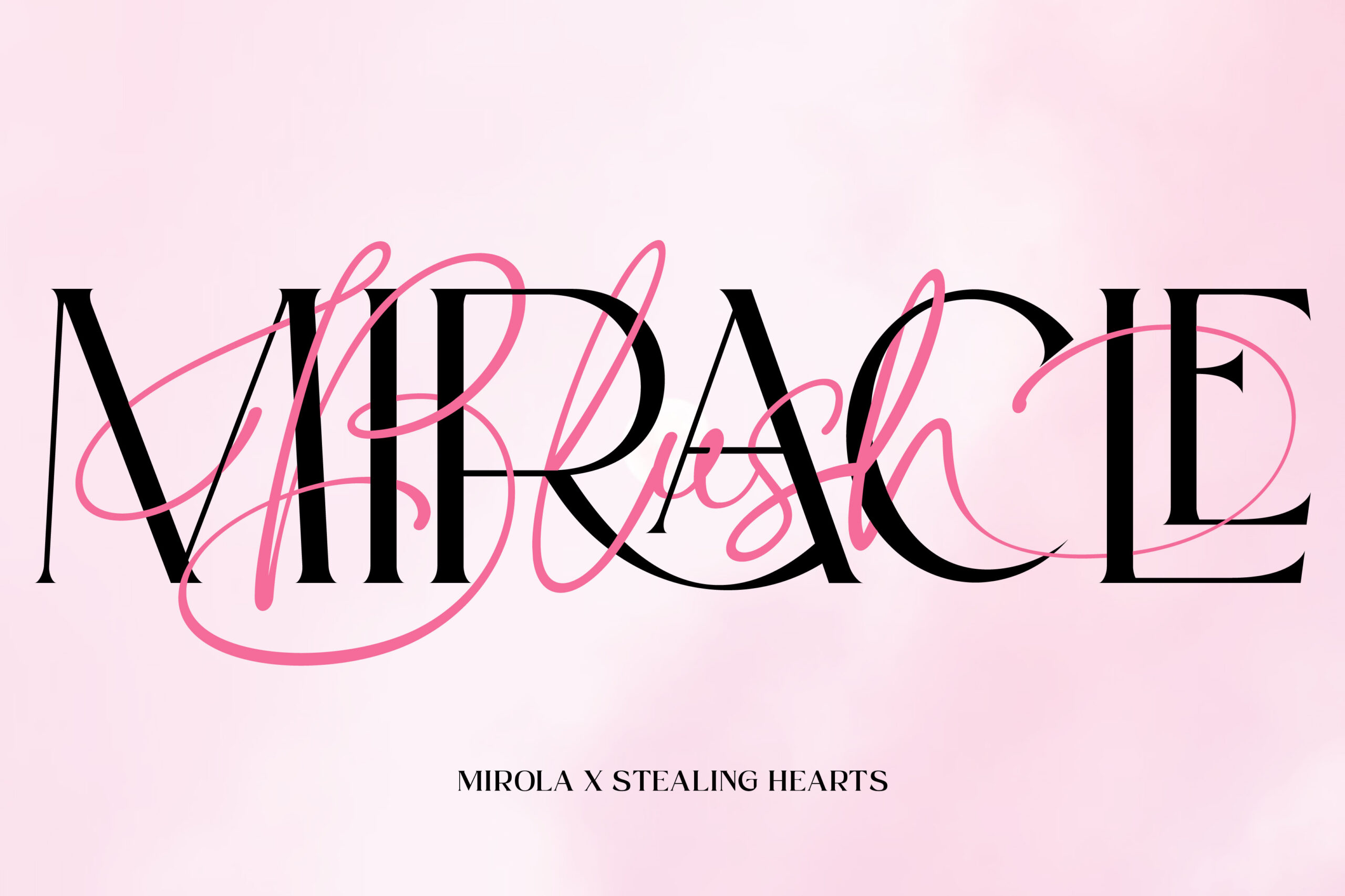
The overlapping font pairing from Mirola and Stealing Hearts showcases a harmonious combination of two complementary character types. Mirola, featuring a slender serif with a thickness contrast, acts as a stable and elegant main structure. Its elegance is evident in the elongated letter proportions, neat serif tips, and visual characteristics that deliver a luxurious and sophisticated feel.
Meanwhile, Stealing Hearts provides a fluid, flexible, and energetic script flow. The elongated, expressive flourish and the dynamic handwritten style make it effective for layer accent. The distinction lies in the flexible and decorative stroke variation, adding an emotional touch to the overall composition.
Ogilen x Rallocate
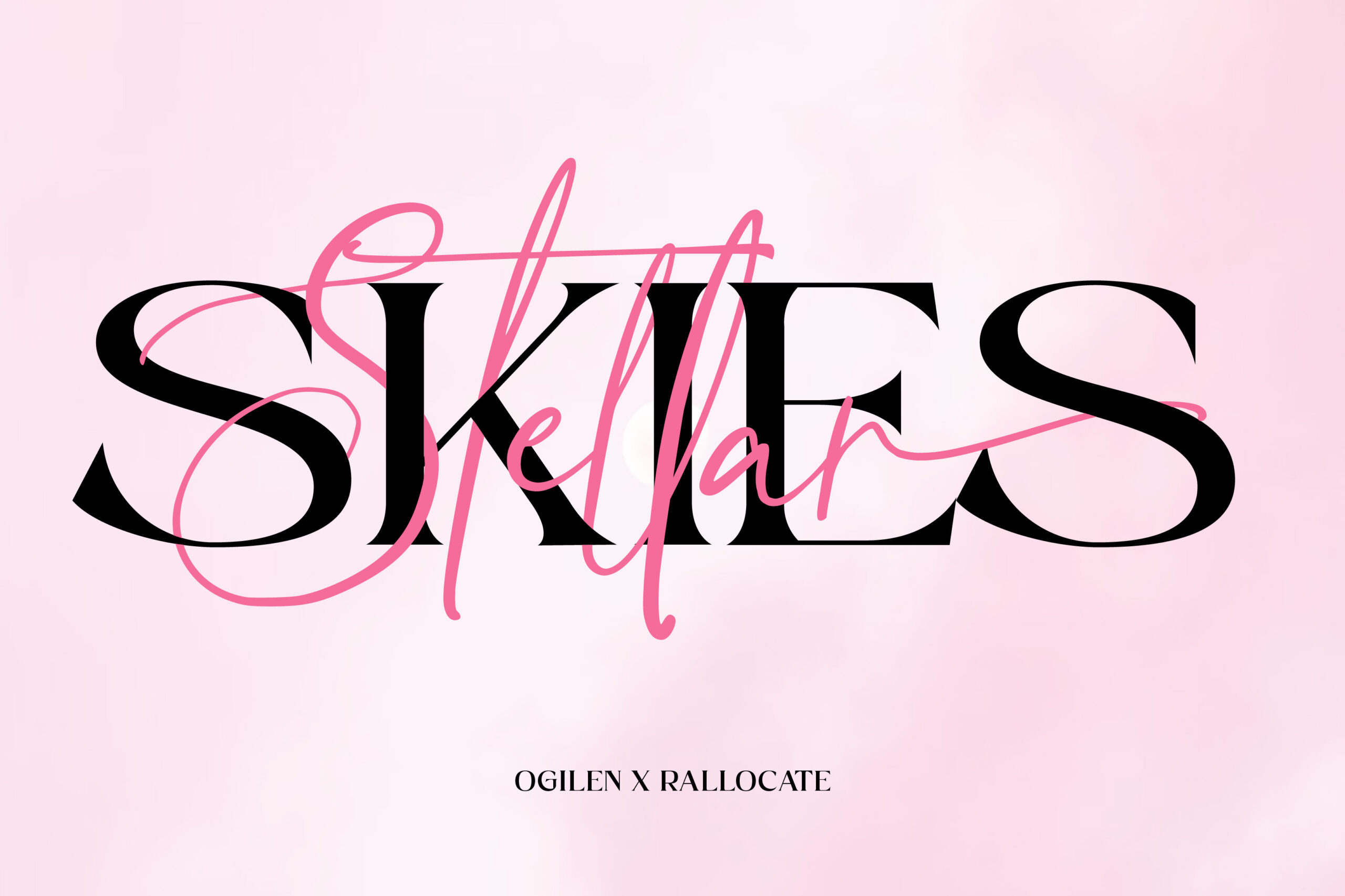
The meeting of Ogilen and Rallocate shows an attractive visual dynamic. Ogilen, with a wide and solid proportion letterform, comes as a calm yet dignified element. The bold lines give a firm impression, making it a strong and reliable typography foundation.
On the other hand, Rallocate showcases a more expressive characteristic with its flexible curve, long line, and the gesture that radiates spontaneous energy from the uniqueness of the handwritten letter. When both are applied as an overlapping font pairing, Ogilen acts as a sturdy layer foundation, while Rallocate moves on top of it to add an emotional flow and vibe.
Mostly Bright x Writable Story
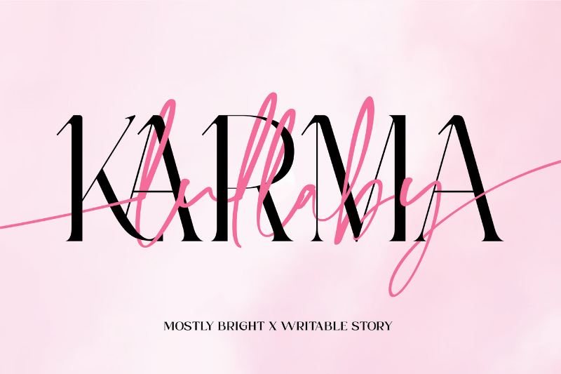
Mostly Bright is a serif font that emphasizes elegance through its tall, thin, and proportional letter silhouettes. This visual character not only creates a luxurious impression but also a directed and stable rhythm.
With a flexible approach, Writable Story offers a more relaxed script style, characterized by long lines, elastic curves, and fluid handwriting expression. Mostly Bright acts as an expressive complement, perfect for the overlapping font pairing technique.
Conclusion
The overlapping font pairing technique demonstrates that combining serif and script fonts can produce a layered, balanced, and communicative typographic appearance. This combination functions through the relationship between the stable serif structure and the expressive movement of the script. Therefore, font selection requires consideration of the character, proportion, and visual role of each to ensure the resulting composition remains clear and effective.
Understanding font characteristics and applying the overlapping technique allows designers to create more directed typographic works. To enrich your visual exploration, you can try various font pairings and adapt them to your design needs.
Use these references as a guide to strengthen the quality of the typography you develop!